Utvecklingen av CSS-arkitektur: Att anamma paradigmet i Tailwind CSS v4.0
Under många år definierades CSS-arkitektur av metodiker som BEM (Block Element Modifier), SMACSS eller Atomic CSS. När Tailwind CSS först dök upp avfärdades det ofta som "inline-stilar med extra steg". Men i takt med att vi rör oss genom 2025 och in i 2026 har Tailwind mognat från ett verktygsbibliotek till ett grundläggande arkitektoniskt ramverk.
Lanseringen av Tailwind CSS v4.0 markerar ett betydande skifte: övergången från en JavaScript-tung konfiguration till en CSS-först-arkitektur. Denna förändring ligger i linje med den bredare branschtrenden att återgå till inbyggda CSS-funktioner samtidigt som man drar nytta av hastigheten i moderna byggverktyg som den Rust-baserade Oxide-motorn. I den här guiden kommer vi att utforska hur man bygger skalbara och högpresterande CSS-arkitekturer med de senaste Tailwind-standarderna.
1. CSS-först-konfiguration och Oxide-motorn
Den mest radikala förändringen i modern Tailwind-arkitektur är att tailwind.config.js-filen fasas ut till förmån för @theme-blocket. Detta tillvägagångssätt behandlar dina design-tokens som inbyggda CSS-variabler, vilket gör din konfiguration till en del av CSS-kaskaden snarare än ett separat JavaScript-objekt vid byggtid.
Övergången till @theme
I v4.0 blir din globala CSS-fil projektets "Source of Truth". Genom att definiera dina tokens inuti ett @theme-block genererar Tailwind automatiskt motsvarande utility-klasser. Detta minskar friktionen vid kontextbyte mellan dina stilar och en konfigurationsfil.
/* main.css */
@import "tailwindcss";

@theme {
  --color-brand-primary: oklch(0.65 0.24 354.31);
  --color-brand-secondary: oklch(0.45 0.15 200.5);

  --font-display: "Satoshi", "sans-serif";
  --font-body: "Inter", "sans-serif";

  --breakpoint-3xl: 1920px;

  --radius-xl: 1.5rem;
}
Denna arkitektur drivs av Oxide-motorn, en högpresterande Rust-kärna som ger upp till 5 gånger snabbare fullständiga byggen. Ännu viktigare är att den introducerar "Automatic Content Detection". Du behöver inte längre manuellt ange sökvägar till dina HTML- eller React-filer; motorn skannar din projektkatalog automatiskt, vilket gör arkitekturen betydligt mer "plug-and-play".
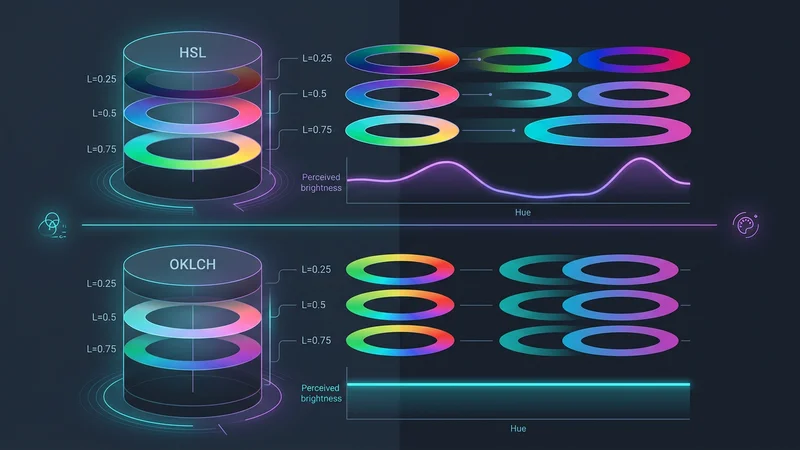
Användning av OKLCH för tillgängliga designsystem
Tailwind v4 använder färgrymden OKLCH som standard. Till skillnad från RGB eller HSL är OKLCH perceptuellt enhetlig. Detta innebär att om två färger har samma ljushetsvärde kommer de att se lika ljusa ut för det mänskliga ögat, oavsett deras nyans (hue).
Arkitektoniskt är detta en banbrytare för tillgänglighet. Du kan programmatiskt definiera "ljushetsnivåer" för dina varumärkesfärger, vilket säkerställer att din text-contrast förblir konsekvent över olika teman utan manuell testning för varje nyans.
2. Avancerade layoutmönster: Från viewports till containers
Under lång tid var responsiv design synonymt med viewport-relativa media queries (md:, lg:). Modern CSS-arkitektur kräver dock modularitet. En komponent bör se korrekt ut oavsett om den placeras i en hjältesektion i fullbredd eller i ett smalt sidofält.
Inbyggda Container Queries
Tailwind v4 integrerar inbyggda CSS container queries. Detta gör att du kan skriva verktyg som svarar på storleken på föräldra-containern snarare än webbläsarfönstret.
// En modulär Card-komponent som använder container queries
export const Card = ({ title, description }: { title: string; description: string }) => {
  return (
    <div className="@container border rounded-lg p-4">
      <div className="flex flex-col @md:flex-row gap-4">
        <div className="w-full @md:w-1/3 aspect-video bg-gray-200" />
        <div className="flex-1">
          <h3 className="text-xl font-bold @md:text-2xl">{title}</h3>
          <p className="text-sm @lg:text-base">{description}</p>
        </div>
      </div>
    </div>
  );
};
Genom att använda @container och @md:-prefixet blir Card-komponenten verkligt portabel. Den växlar automatiskt till en horisontell layout om dess föräldra-container ger tillräckligt med utrymme, även om användaren befinner sig på en mobil enhet.
3.0 UI-djup och 3D-transformer
Modern webbdesign 2025 har rört sig bortom platta ytor. Tailwind v4 introducerar förstklassigt stöd för 3D-transformer. Detta gör det möjligt för arkitekter att bygga djup direkt i utility-lagret utan att behöva skriva anpassade CSS-klasser för varje rotation.
<div className="perspective-1000">
  <div className="rotate-x-12 rotate-y-12 transform-3d transition-transform hover:rotate-x-0 hover:rotate-y-0">
    <!-- Kortinnehåll med djup -->
    <div className="translate-z-10 shadow-2xl">
      Flytande innehåll
    </div>
  </div>
</div>
3. Hantera komplexitet: Komposition framför abstraktion
Den vanligaste kritiken mot Tailwind är "klass-soppa" – de långa, svårlästa strängarna av klasser i HTML. En professionell CSS-arkitektur hanterar detta genom intelligent komposition snarare än förhastad abstraktion.
Regeln om "3+ varianter"
Ett vanligt misstag är att använda @apply för att skapa klasser som .btn-primary för tidigt. Detta skapar ett "skugg-CSS-system" som är svårare att underhålla eftersom du förlorar kopplingen till källan i din HTML.
Följ regeln om 3+ varianter:
- 0-2 varianter: Behåll klasserna i HTML/JSX.
- 3+ varianter eller hög komplexitet: Abstrahera logiken med Class Variance Authority (CVA).
Class Variance Authority (CVA) och cn-hjälparen
I en TypeScript-miljö låter CVA dig definiera ett schema för din komponents stilar. Kombinerat med tailwind-merge och clsx kan du skapa ett robust, typsäkert stylingsystem.
import { cva, type VariantProps } from 'class-variance-authority';
import { twMerge } from 'tailwind-merge';
import { clsx, type ClassValue } from 'clsx';

// 'cn'-hjälparen: Slår ihop klasser och löser Tailwind-konflikter
export function cn(...inputs: ClassValue[]) {
  return twMerge(clsx(inputs));
}

const buttonVariants = cva(
  "inline-flex items-center justify-center rounded-md font-medium transition-colors focus:outline-none",
  {
    variants: {
      intent: {
        primary: "bg-brand-primary text-white hover:bg-brand-primary/90",
        secondary: "bg-gray-100 text-gray-900 hover:bg-gray-200",
        ghost: "hover:bg-gray-100",
      },
      size: {
        sm: "px-3 py-1.5 text-sm",
        md: "px-4 py-2 text-base",
        lg: "px-6 py-3 text-lg",
      },
    },
    defaultVariants: {
      intent: "primary",
      size: "md",
    },
  }
);

interface ButtonProps extends React.ButtonHTMLAttributes<HTMLButtonElement>, VariantProps<typeof buttonVariants> {}

export const Button = ({ className, intent, size, ...props }: ButtonProps) => {
  return (
    <button className={cn(buttonVariants({ intent, size }), className)} {...props} />
  );
};
Denna arkitektur ger det bästa av två världar: hastigheten hos Tailwind-utilities och det rena, läsbara API:et hos ett komponentbibliotek.
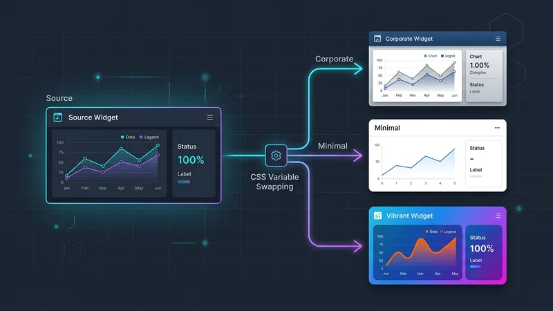
4. Teman för flera varumärken och inbyggda kaskad-lager
För SaaS-applikationer som kräver "white-labeling" eller stöd för flera varumärken, gör Tailwinds beroende av inbyggda CSS-variabler i v4 temahantering trivialt. Istället för att bygga om CSS för varje klient kan du begränsa dina temavariabler till ett data-attribut.
Scopade variabler i @layer
Användning av det inbyggda @layer-direktivet säkerställer att dina basstilar, komponenter och utilities bibehåller korrekt specificitet.
@layer base {
  :root {
    --color-brand-primary: var(--color-blue-600);
    --radius-button: 0.5rem;
  }

  [data-theme='enterprise'] {
    --color-brand-primary: var(--color-slate-900);
    --radius-button: 0px; /* Skarpa företagshörn */
  }

  [data-theme='playful'] {
    --color-brand-primary: var(--color-pink-500);
    --radius-button: 1rem; /* Rundade vänliga hörn */
  }
}

@layer components {
  .btn-dynamic {
    background-color: var(--color-brand-primary);
    border-radius: var(--radius-button);
    @apply px-4 py-2 transition-all;
  }
}
Detta gör att du kan byta utseende på en hel applikation vid körning genom att helt enkelt ändra ett data-theme-attribut på <body>-taggen, utan att lägga till någon extra vikt i din CSS-bundle.
5. AI-redo arkitektur och framtidssäkring
När vi går in i 2026 förändras sättet vi skriver kod på. AI-driven UI-generering (Prompt-to-UI) trivs med Tailwind eftersom klasserna är beskrivande och deklarativa. En LLM förstår flex items-center justify-between mycket bättre än en anpassad .header-inner-wrapper-klass.
Designa för maskinen
För att göra din Tailwind-arkitektur "AI-redo":
- Använd semantisk HTML: AI använder taggar som
<nav>,<main>och<aside>för att förstå strukturen innan den applicerar stilar. - Undvik obskyra anpassade plugins: Håll dig till kärnfunktionerna i v4. Ju mer standardiserad din implementering är, desto bättre kan AI refaktorera eller utöka den.
- Standardisera din komponentmapp: Använd ett mönster som
shadcn/uidär komponenter är lokala i ditt projekt. Detta ger AI:n full synlighet i komponentens implementering, vilket möjliggör mer exakta stiljusteringar.
Vanliga frågor
Är Tailwind CSS bra för storskaliga projekt?
Ja, Tailwind är exceptionellt väl lämpat för storskaliga projekt eftersom det förhindrar att CSS-bundlen växer linjärt med antalet funktioner. Genom att använda ett utility-first-tillvägagångssätt och strikt komponentabstraktion (som CVA) kan team upprätthålla ett konsekvent designsystem utan problemet med "CSS append-only" där utvecklare är rädda för att ta bort gamla stilar.
Ersätter Tailwind CSS traditionell CSS-arkitektur?
Tailwind ersätter inte CSS-arkitektur; snarare flyttar det fokus från "hur man organiserar filer" till "hur man komponerar utilities". Det utnyttjar moderna CSS-funktioner som Cascade Layers och Custom Properties, vilket innebär att du fortfarande behöver en gedigen förståelse för CSS-boxmodellen, specificitet och layoutalgoritmer för att använda det effektivt.
Hur organiserar man Tailwind-klasser i en stor kodbas?
Klasser bör organiseras med en konsekvent sorteringsordning, vilket bäst hanteras automatiskt av prettier-plugin-tailwindcss. För komplexa komponenter, använd cn-hjälparen (som kombinerar clsx och tailwind-merge) för att villkorligt applicera klasser och lösa konflikter, vilket håller logiken separat från mallstrukturen.
Vilka är nackdelarna med att använda Tailwind CSS-arkitektur?
De främsta nackdelarna inkluderar en brant initial inlärningskurva för namnen på alla utilities och risken för "klass-soppa" som kan göra HTML-mallar visuellt röriga. Eftersom det i hög grad förlitar sig på ett byggsteg och specifika verktyg (som VS Code IntelliSense-tillägget), kan det vara svårare att integrera i äldre miljöer utan en modern byggpipeline.
Bör jag använda @apply för komponentstilar i Tailwind?
Du bör använda @apply sparsamt, främst för globala basstilar eller när du arbetar med tredjepartsbibliotek som kräver specifika klassnamn. Att överanvända @apply för att skapa "anpassade komponenter" leder ofta till underhållsproblem och större CSS-bundles, vilket motverkar huvudsyftet med att använda ett utility-first-ramverk.
Slutsats
CSS-arkitektur med Tailwind CSS 2025 handlar inte längre om att undvika CSS; det handlar om att använda modern CSS mer effektivt. Genom att anamma v4.0-konfigurationen med CSS-först-fokus, utnyttja OKLCH för tillgängliga färgsystem och använda container queries för verkligt modulära komponenter, kan utvecklare bygga användargränssnitt som är både högpresterande och otroligt flexibla.
Skiftet mot Oxide-motorn och inbyggda kaskad-lager innebär att våra verktyg blir snabbare och ligger närmare webbplattformens standarder. Oavsett om du bygger en SaaS för ett enskilt varumärke eller en företagsapplikation för flera hyresgäster, ger kombinationen av Tailwinds utility-first-snabbhet och robusta kompositionsmönster som CVA en framtidssäker grund för modern webbutveckling.